
You might not expect it, but we see so many apps in Retool where developers are tossing form fields at their app like an amateur cook throwing nearly-done spaghetti at a wall, desperately trying to see what sticks, and the result can be messy. Most Retool apps are based on some kind of CRUD interface, and with the form inputs that go with this, a little goes a long way to turn a super unfriendly UI into an optimized, beautiful user experience. Here’s a couple of simple tips to help make this happen.
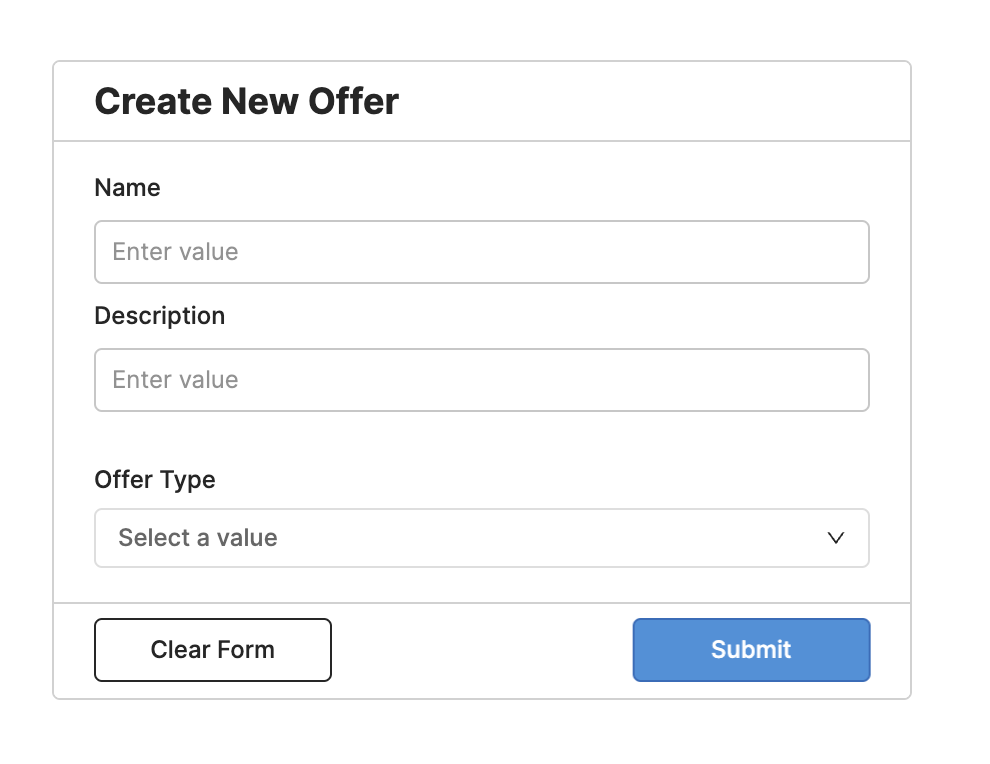
The alignment of your input labels is more important than you think.
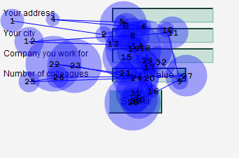
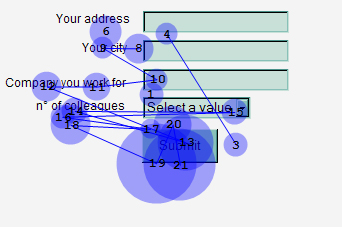
A 2006 study by Matteo Penzo tested the different types of label alignment in forms, and found that top-aligned labels topped the leaderboard by far (pun intended), while right-aligned labels were twice as quick as left-aligned, which came in well below par in third place.
Check out these diagrams from the study, which show where a user’s eye goes when filling out the differently aligned forms (the bigger the circle, the longer the fixation time):
Left-aligned:
Right-aligned:
and top-aligned.
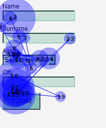
Notice that on the top-aligned design, the user is able to take in both the label and the input field in a single eye movement, and thus can interpret the form quicker, with fewer fixations, where the left-aligned labels force the user’s eye to cover much more screen space to interpret the same information.
Of course, there may be certain app layouts where top alignment is just not possible, but if it is, this data shows that this is the best way to build it.
For the same reason, it’s also really important to create uniformity, i.e. all labels should follow the same alignment throughout your form. When dealing with numbers in an input, opt to ‘left-align’ (the default is often right-aligned in Retool) so that it’s easier to match the value to the label.
Before:
After:
Retool offers so many useful ways to customize your form fields, labels, and placeholders. So, use them! Keep your label text short and sweet - there shouldn’t really be any need to have overly-lengthy text explanations here. The longer the label, the more time it will take your users to read and interpret it. The same applies to capitalization - all caps are much harder to read than standard capitalization of each key word - so opt for the latter and avoid shouting at your users.
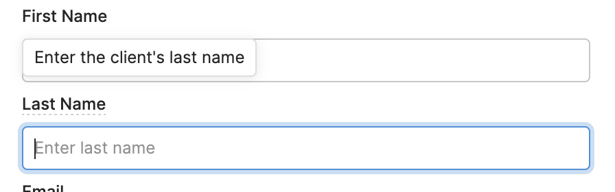
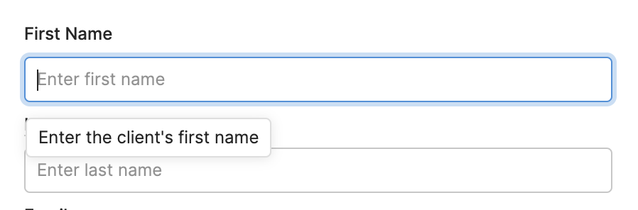
If you do need more information for form fields, use Retool’s placeholders and tooltips to give your users more information. A placeholder makes it clearer what type of information you are looking for, e.g. with this search bar, which clarifies exactly what you are searching by:

Also useful can be icons, which indicate a search function with the magnifying glass, a longer comment section with an ‘info’ icon, and many more. Humans interpret images and symbols much faster than text, so the simple addition of an icon in the prefix or suffix of the input box can make a world of difference.
Important Note! While placeholder text is great for expanding on the instruction given by the label, it shouldn’t be used to replace the label itself, as the lighter text color can mean this label is missed entirely, and the label will disappear as soon as the user starts typing.
Furthermore, tooltips or ‘helper text’ can also be super useful if a longer explanation is needed, as it keeps this text hidden away until the user needs it. A Retool tooltip will add an underline to the input’s label and users can see more information on hover, and ‘helper text’ appears automatically when the user clicks into the input box. The latter is most useful when there are frequent errors being made in the same place, to make sure all users will always see the helper text.
Tooltips:
Helper text:
In addition to this, Retool has now made it even easier to match your input components and symbols to the appropriate data type with their pre-made selection of variations:
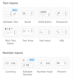
This helps users with interpreting data forms, but is also much better for data validation (we’ll get to that later).
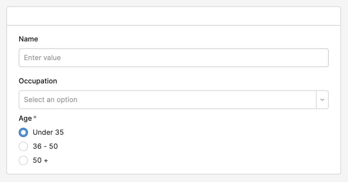
A final touch to help with selections is considering the type of input component: text inputs, versus dropdown selection, or even radio buttons. Text inputs are useful for notes and the like, where each data point will be unique, but select components are better when values come from a predetermined selection. Bear in mind that even if you have hundreds of possible values, you can toggle the ‘combobox mode’ so that the user can begin typing into the component to pull up the closest match.
When there are 4 or fewer options in a dropdown, consider using radio buttons, which are shown in studies to be much faster to complete.
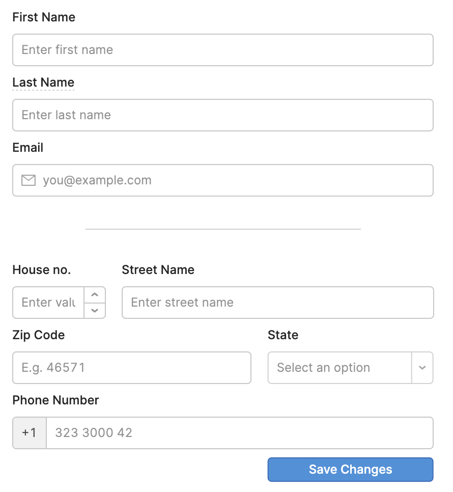
In general, you should maintain consistency across your field lengths: irrespective of whether they are text inputs, multi-selects, dropdowns or even value sliders, it is simply easier to read and use a form when these lengths are consistent.
But just because these fields should be consistent doesn’t mean they should be the same. Consider extending the field vertically down the page if the text input could be large (e.g. for a comment section). If all your inputs are very long, with only a couple which are much shorter (e.g. number inputs), it may be more useful to condense those shorter inputs onto the same line to avoid wasting space, particularly if that data is grouped.
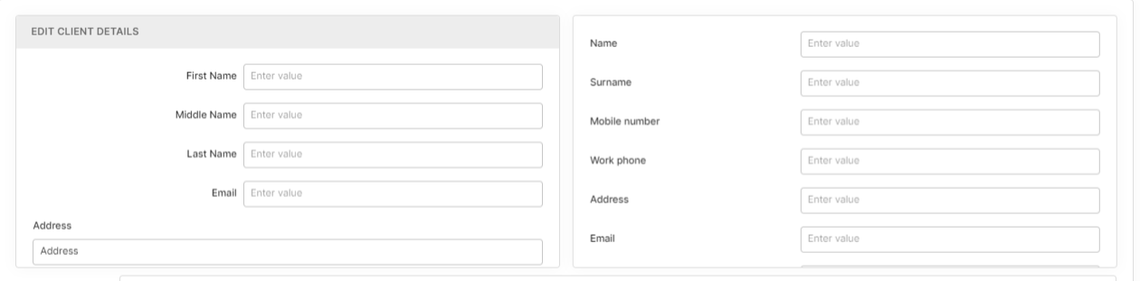
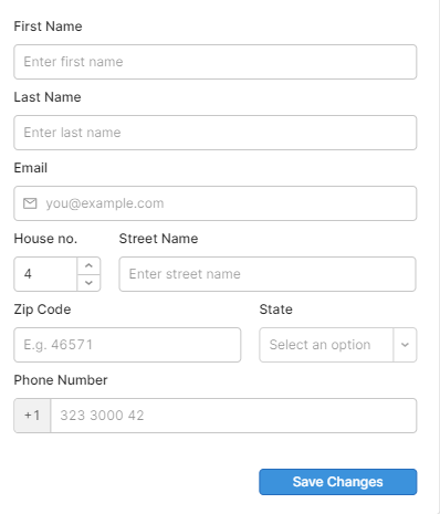
A great example of this grouped data is home addresses, where street names are long, zip codes short, and house numbers even shorter. Here’s an example of how you could group these to make the data easy to input, and save space:
While the wide-screen layout of a Retool app may make it tempting to extend forms widthways, it’s not great for UI at all. In fact, it’s much better to put all form inputs into a single column, allowing for better readability, and maintaining a clear path to completion. It’s also better for keyboard shortcuts and tabbing through each input, which in turn, is good for accessibility as well as speed in completing the form.
Now some of you may already be in the habit of using the lateral real-estate of the app a little too indulgently, and are rather partial to a multi-column form which keeps the form space much shorter, so just in case you still need convincing, we have some cold, hard proof, that single columns are just... better: this CXL study found that the same form in a single-column format was completed significantly faster than a multi-column version of the same form, where even the slowest single-column completion times were speedier than the quickest multi-column completion times.
Grouping relevant data collection fields together is a fairly intuitive idea for most developers, but what’s particularly effective is allowing whitespace and breaks between each of these groupings - giving the user the opportunity to process information and have a little breathing room.
A great way of doing this is using the Retool divider component. Think about it as breaking what can be quite an arduous task into achievable chunks of work - giving your users a greater sense of satisfaction and a better user experience (and often more effective results).
If certain fields or groups of fields are rarely used, it’s also a good idea to create an expandable section of the form for when it is needed, to keep the commonly-used fields as a priority, and the interface tidy and effective.
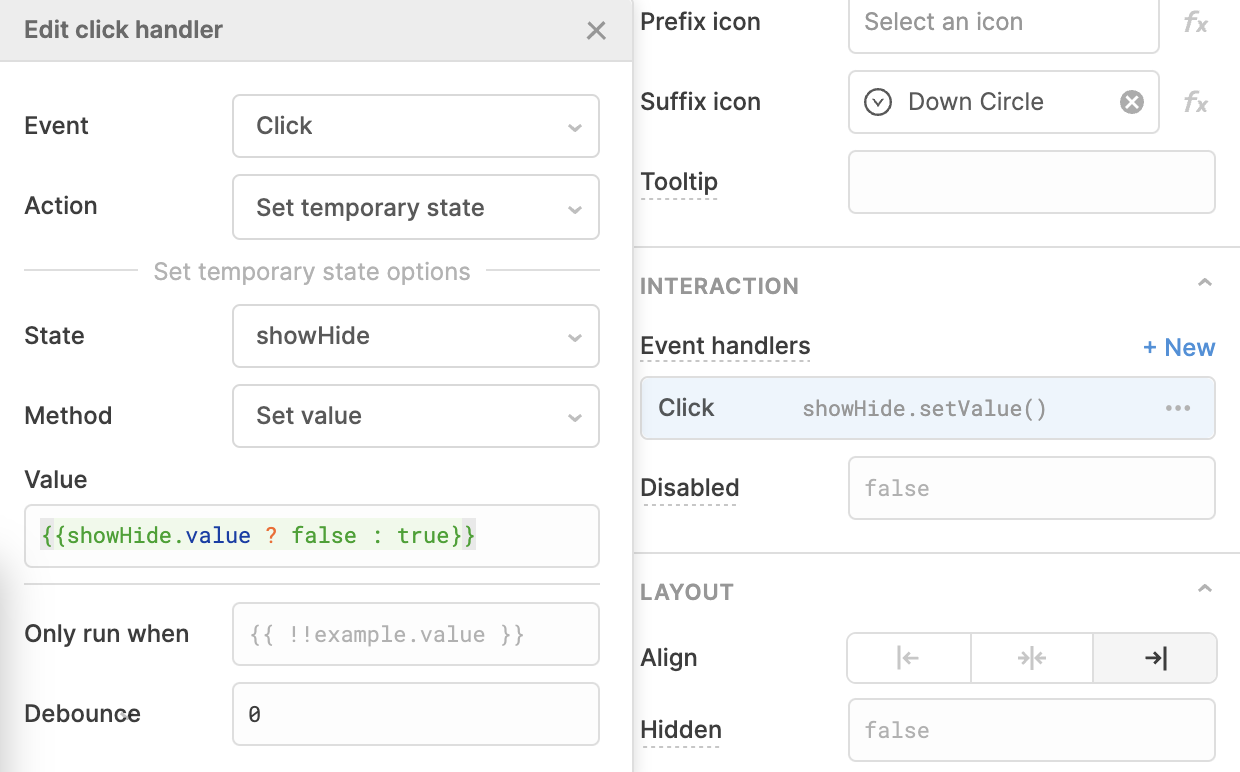
To do this, you can add a toggle link and label it according to the hidden details.
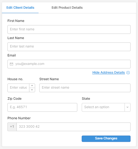
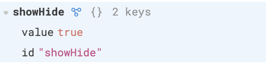
Then create a temp state, with the default value as ‘false’. Back in your link event handlers, add an ‘on click’ event that sets the temp state to show or hide alternately. This is how this could look:
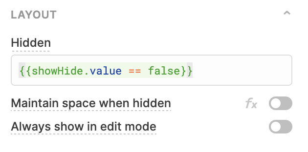
Next, add the following to the ‘hidden’ value of each component you wish to dynamically show and hide.
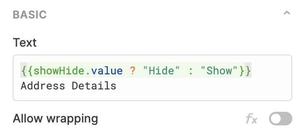
Finally, set the text to change dynamically.
Smart UI is also about using Retool’s automation features to help your user use the app even more effectively.
This means things like using default values intelligently, predicting what the user is likely to answer, or setting the default of a select component to be the most commonly selected value each time. Make sure to get regular feedback from users once the app is in production, to find out how you might optimize these defaults further.
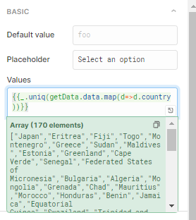
For data inputs, another useful trick is using a dynamically-updating select component to provide users with all the available values in the backend instead of a text input – to avoid human error. If you have an array of non-unique values for instance, you can do this with the Lodash ._uniq function or using SELECT DISTINCT in a SQL query.
As we mentioned in point 2, you can then toggle the ‘combobox’ option so that users can begin typing to search for a value, and even the ‘allow custom values’ toggle so that users can still add a new value if needed.
When using table components, there are many things you can do to automate the processes between the table and form. Many apps involve filtering a table for data, and using a specific row to then complete a CRUD interface. The best tool for automating this is the table.selectedRow.data property, as well as currentRow in some circumstances, which can help to pre-fill edit or create forms, by inputting the current data into the text input as the default value, and allowing the user to update this value.
Here is an example of how you can use this:
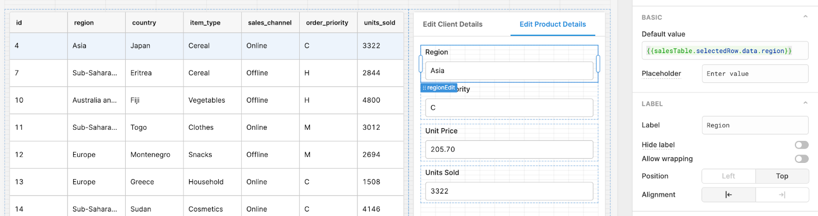
This is particularly important for edit modals, as the table data may no longer be visible once the modal has been opened.
Another trick when your app is based on a table data --> CRUD layout is to use the ‘.focus()’ JavaScript method/event handler, so that when a user selects a row (or another action), the first input box is ready to go. This is especially useful when your users are tabbing, and is great for accessibility too.
You can do this in a script, or even simpler, in the event handlers of the table component. Your event handler might look something like this:
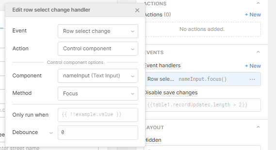
This means that when the user selects a different row, the nameInput is immediately focused on, and the user can begin typing without clicking inside. You can also use the ‘Only run when’ to set a focus that changes dynamically according to the data.
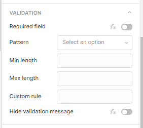
A key element of CRUD interfaces is data validation: making sure that users cannot input false or invalid data into the backend. What goes closely alongside this however, is user feedback, so that the user can intuitively understand why the data is not valid.
Thankfully, Retool has some brilliant low-code methods for validating data, and almost every component has a ‘validation’ section which allows you to set key conditions for the data before submission:
Event handlers also provide a great way to trigger notifications for success or failure of form submission, which can be customized for the user to display a message, indicating the issue to be fixed.
We cover some ways to use notifications and more effectively to give user feedback in our buttons UI tutorial, so head there for some more ideas!
Something that is often overlooked is the importance of clearing (or not clearing) submissions upon success. Using a form component is great for this, as it can be toggled to clear automatically on submission.
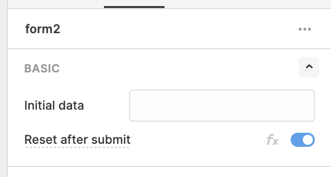
However, for some apps, it may actually be more useful to leave the form uncleared, for instance if subsequent submissions feature much of the same values, or you are simply editing data. In this case, make sure to insert a button with an event handler to clear each input on click.
Note however, that you don’t place the ‘clear’ button anywhere near the ‘submit’ button - or else you’re likely to find some frustrated users accidentally wiping their inputs instead of submitting them!
Ideally, ‘Edit’ forms will always be auto-populated with the information from the backend, and upon submit, simply refresh to the new values rather than clearing. ‘Create’ forms however will clear on submission, unless of course you are submitting similar forms one after another.
Our final set of tips for this CRUD form UI session is the importance of thoughtful layout for your components. There is no cookie-cutter formula for this, but the beauty of Retool is that even after you have connected all your data and components, you can still easily rearrange the UI of the app to suit your users best. Here are a few of our observations, as a little food-for-thought:
When your app involves updating a record in a table, it is best when the edit form pops up in a modal with the default values auto-populated with the data, rather than being positioned next to the table, as with the side-by-side layout, it’s easy for users to accidentally edit data instead of just viewing it. The side panel option is great for viewing a drill-down version of your data and its attributes, but edits are best placed out of harm's way in a modal.
Additionally, create and update form inputs should mirror each other to avoid errors being made. If you rearrange the order of inputs, users may get confused when they begin to get used to a certain layout.
Finally, each process of your CRUD should feel separate to give clear differentiations between these actions - if your read and update don’t have that separation it’s easy for a misclick to change data accidentally. Likewise, delete actions should always be very separate and clear, preferably with a warning/validation message for important data. A useful option for this could be our action dropdown, which you can learn how to do in our UI for buttons tutorial.
1. Use top-aligned labels for your components to speed up processing and completion time for users
2. Keep input labels short and sweet, use placeholder text to expand information, and helper/tooltips to help users fill out information. Use appropriate components for data types to avoid error and speed up completion, such as dropdowns or radio buttons.
3. Keep field lengths consistent, but consider condensing shorter, grouped data inputs onto a single line (such as for addresses)
4. Always favor a single-column entry form over a multi-column one, allowing users to interpret data quicker and tab through fields
5. Group related content and include whitespace and dividers to give breathing room to process. Consider a show/hide toggle to tuck away less-used data inputs
6. Use smart automations and data defaults intelligently - make good use of table.selectedRow to pre-fill inputs for CRUD interfaces, and set the most commonly selected options (e.g. in a dropdown) as the default. Use the focus() function to auto-select the first field.
7. Include clear data validation so users can understand what's wrong if their form won't submit - and make sure the form can only submit when the form is correctly filled out.
8. Normally, clear form fields for 'create' forms on submission, or if bulk creations are needed, consider leaving fields filled to speed up subsequent entries.
9. CRUD basics - edit modals before side panels, keep create and update forms identical, but clearly differentiate each CRUD action (read tip 9 above for more details)
----
Of course, there is plenty more to say about CRUD in Retool, but this is a selection of some of our ideas. Have these tips helped you improve the UI of your app at all? Have you used any of our tricks in new and unique ways? We’d love to know! Send an email to sophie@boldtech.dev, we’d love to hear from you!
Many thanks to these sources for their valuable research:
http://static.lukew.com/webforms_lukew.pdf
https://cxl.com/blog/form-design-best-practices/
https://medium.com/nextux/form-design-best-practices-9525c321d759
https://www.uxmatters.com/mt/archives/2006/07/label-placement-in-forms.php
More info about forms in the Retool docs:
https://docs.retool.com/docs/choosing-a-form-component
https://docs.retool.com/docs/working-with-json-schema-form
https://docs.retool.com/docs/building-a-workflow-with-the-retool-wizard
Joey and the team at BoldTech have been amazing partners to us from the start, helping us turn our proof of concept into paying enterprise contract in a matter of months. They feel like a natural extension of our team, and we have been incredibly impressed by their ability and willingness to dive into a complex domain and be strategic thought partners in solving nuanced workflows and complex data problems.

Bold Tech were the right fit for TVadSync to accelerate our use of Retool platform. We had both user experience design needs as well as back end data design needs that were quickly resolved by the team. We will be using them for all Retool app development moving forward. Highly recommended.

We build internal tools, fast.