

Retool has recently released its new sidebar frame - a new way to add vertical navigation into internal applications. The new frame makes it easy to layer application navigation in an intuitive and aesthetic way, on both mobile and desktop.
Let’s jump into the new frame and some designs & styles that this new feature unlocks. In this article, we’ll discuss functionality and limitations, provide a couple of different layout ideas, as well as some UI tips and tricks for using the sidebar in internal apps.
How to add a sidebar frame component to your Retool application
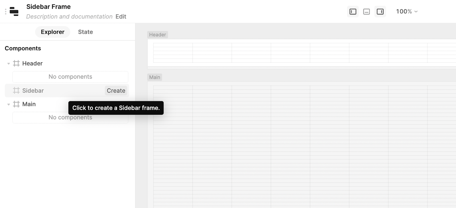
With this new feature release, Retool has separated the application canvas into three separate frames: a fixed main frame, a horizontal header frame (often used for high-level navigation), and the new sidebar frame.
We can see this base layout in the Retool editor by opening the left panel and selecting the explorer tab. As we add new components to our Retool application, they will fall under one of these three frames. You can add a header and/or sidebar frame by hovering over the frame in the left panel and clicking Create.
Possibilities and limitations of the Retool sidebar frame
Having a sidebar in an app is a great way to organize or hide information or functionality that is not always needed, and add detailed navigation and app settings. The integrated feature means developers are no longer having to hack sidebar options using hideable containers. The sidebar frame can be fixed to the app and thus always shown, or it can be dynamically hidden and shown using a button (or other trigger) and event handlers.
Limitations of the sidebar frame
Nevertheless, there are still some limitations to its current functionality. These frames currently cannot be resized the same way a fixed component can be. They will auto-adjust to the components inside but in the case of the sidebar, it is set to a fixed width of 240px for now. There is a CSS hack to bypass this, that Bengahtan kindly shared in the Retool community, but note this could break at any time.
If you use a header frame too, the sidebar will always be rendered below, which may cause some jumping if you are using it to navigate between pages where the header frame is not consistent. For this reason, if you are using the sidebar for multi-app navigation, we recommend keeping both header and sidebar frames the exact same across apps. Additionally, when the sidebar is open, it justifies the app left, which may alter the layout slightly.
The sidebar is also only available on the left-hand side of the canvas, which is usually an intuitive space for navigation and settings UI, but may be less so if the app triggers it to open/close from the right-hand side of the canvas (from a table custom column button for example). For this reason, it isn’t the best place to place expanded details about table records, for instance, as the sizing is limited, and based on common practice, the user may expect such information on the right-hand side.
Best use cases for the sidebar
Retool has already covered some of the most common use cases in their blog, including using the sidebar for:
- multi-app navigation,
- in-app navigation (like tabbed container switch view and scroll into view)
- reducing clutter in tables by adding filters to the side panel
We are going to cover these in more detail, whilst also covering some additional UI/functionality tips and ideas, before diving into some additional use cases.
1: Second-tier navigation for multi-page applications
The most common layout pattern in Retool is typically top-level page navigation to different apps using the header frame (think Home, Accounts, Organizations, Billing, etc.). But, this system is limited in terms of secondary links within these main categories. When using too many links the header bar becomes quickly cluttered and confusing. Developers often navigate this second tier of division within main apps by using tabbed containers.
Now with the new sidebar, this can be dealt with in a much more UX-friendly way, using the kind of intuition we typically see with website navigation. We recommend keeping the main apps organized in the header bar, keeping this as simple as possible (we recommend 5-6 links max), and then organizing the sub-navigation for each page into the sidebar, as below. This is by far the most common usage of the sidebar frame, so let’s run through some different elements to consider.
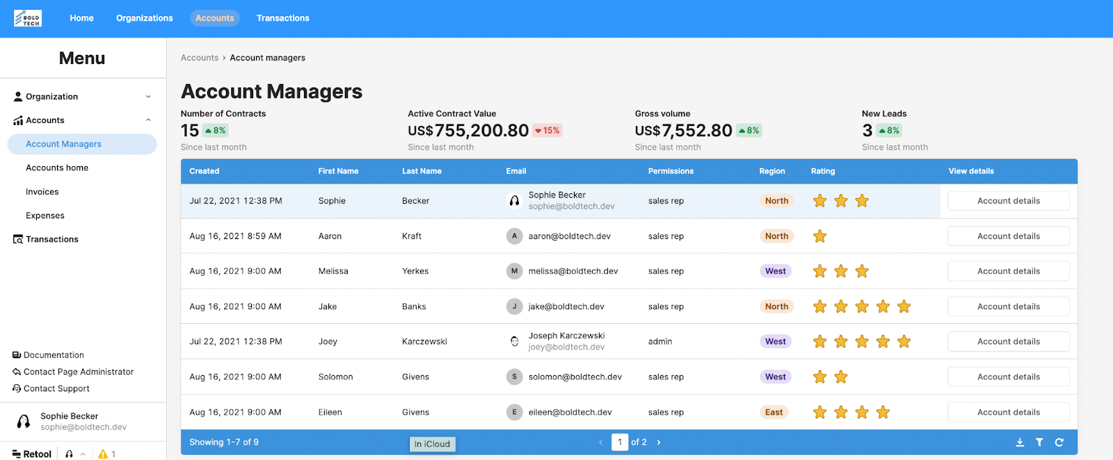
A great way of using the sidebar for large multi-app infrastructures is using toggle options to nest and organize links into a clear navigation system. You can include these by using the ‘Navigation’ component and adding sub-links. This allows you to organize different links into categories, and create consistent navigation bars that include all links across all apps, including useful external ones. Keeping the navigation exactly the same across all apps is the best system for good UX as users can become quickly familiar with the layout.
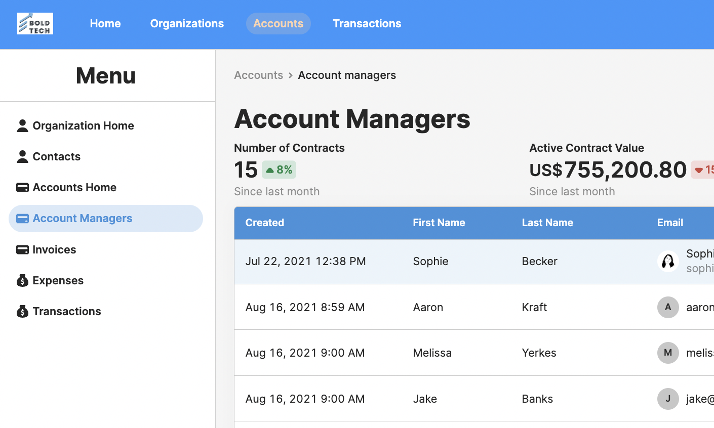
If you use the ‘Navigation’ component and directly link to an app, the selected page will remain highlighted, which makes the navigation more intuitive. Note that if you use the ‘custom’ link in this navigation component you will need to code in the ‘highlight’ option.
The limitation of this option is the inability to include a third tier of nested links, as well as the fact that the main option is a toggle and not clickable itself.
While toggle options keep the organization tidy, having all options on display at all times would require one less click, so this is worth considering when users frequently switch between apps and might prefer the element of speed.
If you do choose not to use toggles, make sure you still group links into clear categories to help users navigate more effectively. We did this using icons, but you could also use the divider component.
Within apps, you can use the ‘scroll into view’ action within event handlers to create anchors on pages. This is great for any pages that go off the bottom of the screen.
Additional UI tips for better sidebar navigation in Retool:
If you decide to use both sidebar and header navigation, keep the header as simple as possible to avoid overload. Studies in web navigation UI have found that users initially take in information in an F-shaped Pattern - first reading the entire header before looking down the left side to read other options. Overloading the top panel will only lead to the user wasting time looking for each page.
People work very visually when navigating applications, and this additional visual information helps to make decisions much more quickly. Make sure that the currently selected page/app is highlighted within a nav menu. This is simple within the Navigation component but may need to be coded into other options.
Use icons as much as possible alongside the name of a page to make selections more intuitive. One limitation of the sidebar we’d like to see changed is the fixed width - if a dynamic width option is added then a great UX/UI design is to have the full menu collapse to just show icons as links and create more space in the app. Hopefully we’ll see this soon!
While we’ve already covered this, we also want to restress the importance of grouping links in the navigation, whether in dropdowns to maintain tidiness, or always on display, to help users find what they need faster. You can break these up with headers or even dividers.
2: Table Filters
Perhaps the second best use case of the side navigation bar is table filters. Table filters can take up too much space in-app. With the new sidebar navigation, we can quickly show or hide filters without using too much precious screen real estate. This is a very intuitive UI that is used throughout web applications and websites, so is a great way to organize your internal apps too.
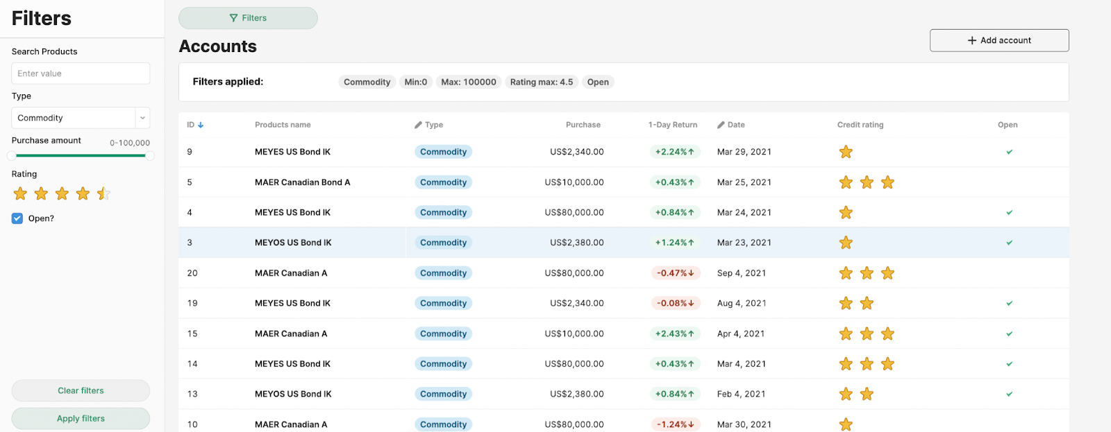
UX/UI Tip: If this is a collapsible container (and arguably, even if it is fixed) it’s good UX practice to display the filters that have been applied above the table itself (see image above). This means that users can quickly view the state of the table and are less likely to make mistakes based on a misreading of the data. You could do this using the tag component within a container (that hides when no filters are applied), which shows values according to the filters selected. This makes sure that users are aware that their data is being filtered, and what filters are being applied.
When creating a hideable sidebar, make sure to keep the show/hide button close to the left-hand side, to make sure its use is intuitive.
We don’t think this solution is the best option if you need so many filters that the sidebar becomes scrollable - this can quickly become difficult to manage for users. Instead, we would recommend keeping the filters above the table. We explain this option in our Table filters for SQL beginners tutorial.
3: High-level statistics
In Retool, screen space can be quite limited, so less pertinent functions are best displayed as secondary to the main data set, and the sidebar is great for this. We find that helpful overview statistics don’t often make it into an application as there’s usually not enough room on the screen. With the sidebar navigation panel, we can include useful, hideable statistics about the data we are working with.
Here is an example:
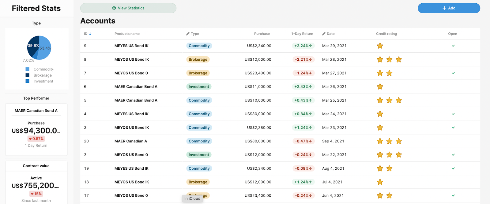
We can put statistics in a place in the app that keeps them tucked away and doesn’t reduce our ability to interact with the main functionality. Make sure this data is clearly labeled as ‘Overview Data’ or ‘Filtered Stats’ according to its implementation so that users don’t misread or make false assumptions based on it.
4: In-app comments and discussion
On a similar note, the sidebar can also be used for in-app commenting, either on a high level or for adding comments to specific records. In the case of our accounts app, this might be to make a comment on the performance of a specific bond within a details page. This can also be useful when building the app and working with initial feedback from users.
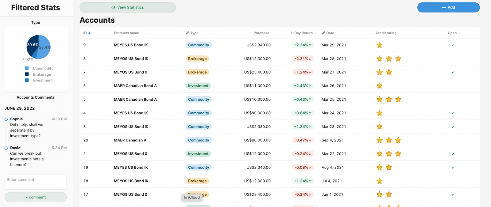
It’s important to note, however, that if most communication happens elsewhere in an organization (such as in a messaging platform), segmenting comments and discussion into a Retool app can things more complicated - consider this before using comments in an app.
5: Personal user settings and support options
Our final layout idea is focused on personalizing the app experience for users. This could include personalized settings for accessibility, functionality, or access to support and documentation. With any app or app infrastructure, it’s great to equip users with as much relevant information as possible, without overloading them, as well as give key customization options to improve a user's personal experience.
When it comes to internal apps, your users might be making constant use of the app to complete critical tasks, and equipping them with the ability to personalize their layout and other functionality will make for a more efficient app.
Let’s run through how to include these options.
Account/user info
If you want users to be able to see their specific account you can use the ‘Avatar’ component and link it to the current_user global attribute.
Report a bug
You can use this to send information to any of your ticketing systems that are integrated to Retool, but in our Bug Reporting with Asana tutorial, we teach you how to automatically include all the information about a bug in the ticket itself, which should help make debugging much easier for your developers.
Dark mode toggle
Perhaps this is wishful thinking from us - there currently isn’t a way to trigger a theme change from within the app, and hopefully, it’s something that Retool will add soon. Here is one solution from a community member - it’s a decent amount of manual work for more complex apps, but definitely doable if it’s something your users need.
User/Accessibility settings
Again, there isn’t currently a tidy way to save user settings in-app, but we have found one solution by using a simple database, like GSheets, which saves user preferences. It’s great to have accessibility settings, to ensure that all users are able to work effectively within the app. In our accessibility settings tutorial, we run through how to set font size and line height/spacing, font type for better readability, and color for various needs (as well as other accessibility tips).
In our user settings tutorial, we discuss how to show and hide certain elements, and how to allow users to choose default ‘views’ for tabs, graphs, and containers to prioritize the information they need most.
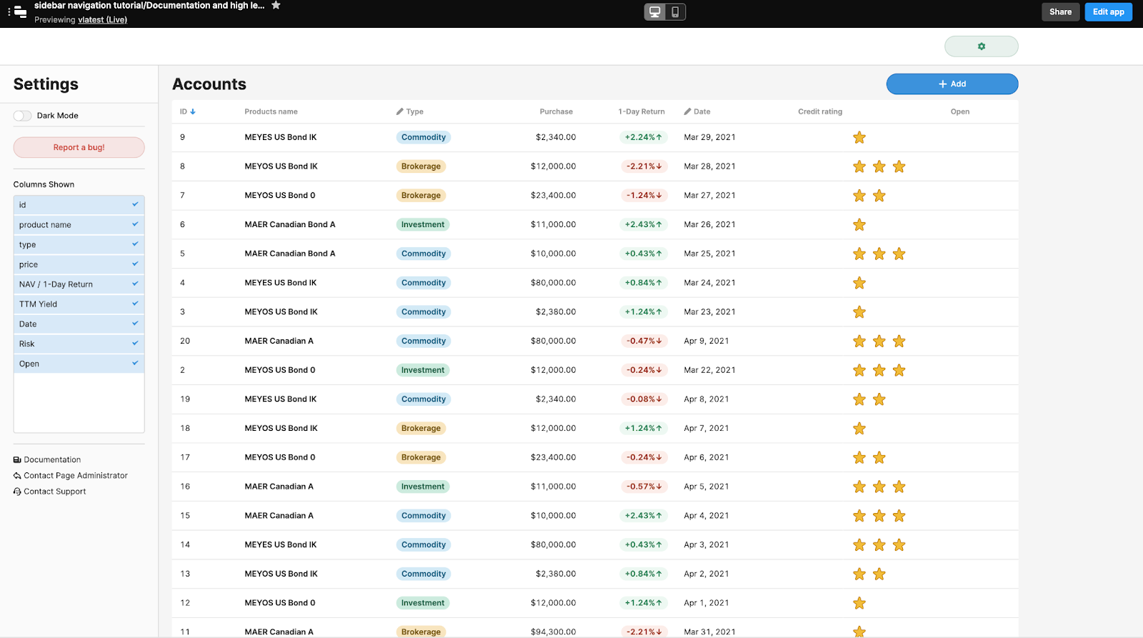
Columns shown
In our user settings tutorial, we also demonstrate how to adjust the columns shown in a table, which you can use to create the functionality in the sidebar layout above.
Documentation and contact links
This one is pretty self-explanatory, but it can be great for UX to include links to app documentation and other support or contact options, especially if your app serves a large number of users or the team is non-technical. A sidebar is a great place for these navigation options to remain consistent, so users can access this information from anywhere within your internal app infrastructure. You could also include a feature request form that links to a ticketing system to Slack, to organize user feedback more clearly.


